Context
A core security-engineer workflow is investigating posture by asset: look at your high-priority assets and see what’s risky. The standard way to show this — and what we were tasked with designing for Prisma Cloud’s asset inventory — was, for each asset, a list of every CVE, finding, and risk attached to it. More data, more complete, surely better.
The insight
Through our design-partner program, we learned that the flat list was noise. It doesn’t matter how many critical CVEs an image or a serverless function has if they all sit on packages with no available fix — especially when the asset is business-critical and won’t be taken offline over them.
A CISO at a large UK enterprise made it unforgettable: nearly every one of his assets was red, because each had at least one unfixable critical CVE. “That’s just the state of the business,” he said. What he actually wanted to know was “where do I get the biggest bang for my buck — which one package can I update that propagates across 1,000 images in use and cuts my risk the most?” We validated the sentiment across every other design partner. It was unanimous: help us prioritize risk reduction, not just enumerate CVEs.
The reframe
Risk is a probability game. The job isn’t to count risk — it’s to reduce it. If knowing about a vulnerability doesn’t change what you’d do, it’s not worth surfacing first. So the inventory should rank by actionability: what’s patchable, and how much risk each fix actually removes.
What we designed
We rebuilt the asset inventory around that idea:
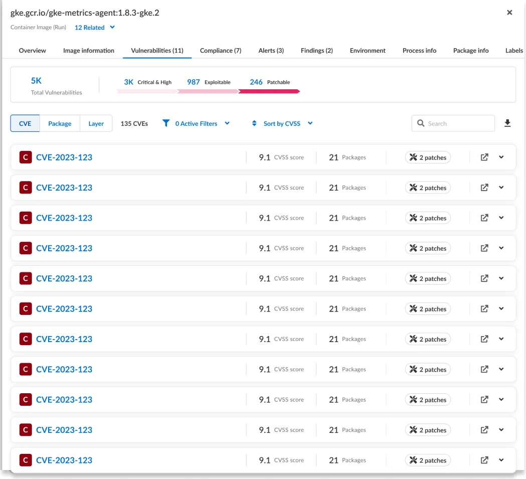
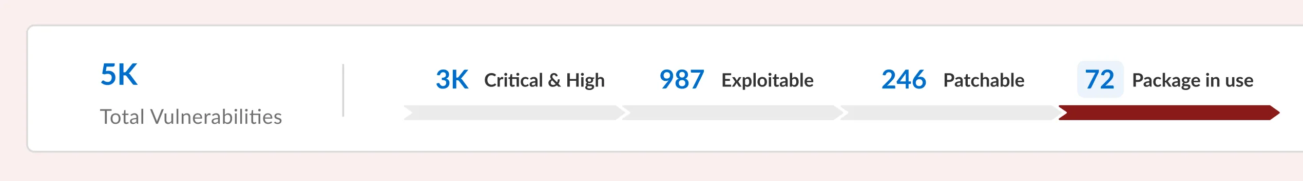
- A “patchable” funnel, front and center. Instead of leading with the scary headline count, the Vulnerabilities view funnels thousands of critical CVEs down to the dozens that are actually patchable — start from what you can act on, not the full firehose. (See the demo and the Vulnerabilities panel below.)
- Every vulnerability tagged with whether a fix exists and how many packages/images it impacts, so the highest-leverage fixes float to the top.
- A “package in use” filter, added as a further upgrade. Patchable still wasn’t precise enough: a fix being available doesn’t mean it’s worth doing if the vulnerable package isn’t even loaded at runtime. So we added an in-use signal to filter one level deeper — to the vulnerabilities that are patchable and sit on a package actually in use.
- The result is a funnel from the headline number to the few that truly matter: 5,000 vulnerabilities → 246 patchable → 72 patchable and in active use.
Outcome
This one is a reframe, and the outcome is the shift itself:
- Moved the product’s mental model from “how bad is it?” (volume and severity) to “what’s the highest-leverage thing I can fix?” (actionability and ROI).
- Grounded the change entirely in direct customer evidence — a specific CISO, validated across every design partner — not a designer’s hunch.
- Cut through the alert fatigue of a sea-of-red inventory: when everything is critical, ranking by what’s actionable is the only useful view.
- Left behind a reusable principle for the team: design for the decision, not the data.
What I learned
The highest-value design move here wasn’t a new screen — it was a reframe of the question the product answered. All the data already existed; the value was in surfacing the small slice that’s actionable and getting out of the way of the decision. And it only surfaced because we had a standing line to customers — the kind of insight you can’t get from inside the building.